48 Designer-Approved Font Combinations for Your Website
Fonts Convey Feelings.
The fonts we choose to use on our websites (and our brands in general) play a huge part in how our audience perceives us.
Do you want to be perceived as luxurious, elegant, and sophisticated? Or would you rather appear bold, energetic, and rebellious?
Or do you want to be seen as — to quote the classic SNL sketch — “A thoughtless child, wandering by a garden, yanking leaves along the way?”
Here’s another classic example of how fonts influence feelings.
One simple, three-word phrase, delivered two ways:
Well isn’t that nice! It’s good to know someone competent and friendly has our back.
This font uses serifs — those little “hats” and “feet” on some letters — to deliver a feeling of trustworthiness, while its thick vertical strokes create a sense of friendliness.
What if we try another font?
Oh. Oh no. That changes the meaning entirely.
Ok, so we understand that fonts influence how our words are perceived.
But it goes beyond that. Fonts are often used as part of a font pairing or font grouping, and the interplay between these fonts can either look harmonious (bringing trust and authority to your brand) or dissonant (conveying a feeling of shoddiness).
So let’s talk about…
Font Pairing 101
When we talk about font pairing, we mean combining two (or sometimes three) fonts in a way that works together.
Typically when picking out fonts for a website, we’ll choose a Heading font, a Body font, and sometimes an Accent font.
Quick Tip: How do you know if two fonts pair well together?
One simple technique is to look at a few key letters in each font: a, e, g, o, and t. Do they have the same general shape? If you draw lines through the top, bottom, and middle of the letters, do they line up? Then these could make a good font pairing!
How to Use This Guide
Choosing fonts to pair can be difficult and frustrating for non-designers. You might find two fonts you love, but they may just not work well together and it can be really hard to figure out why.
To simplify things, I’ve created a bunch (48 in total) of suggestions for you. These suggestions start with 10 of my favorite Heading fonts. Then, for each Heading font, I recommend a 3 to 6 Body fonts guaranteed to pair well.
All you have to do is find a Heading font you love, choose one of the recommended Body fonts to go with it, and you are off and running with a professionally designed combination!
And yes, all the recommendations below are fonts available in both Squarespace and Canva, making them easy to use across all your channels.
Want to go deeper?
Get the Complete Guide to Fonts
Including my favorite 48 font pairings, a full list of fonts available in both Squarespace and Canva, and more.
Alright! Let’s get into each of the ten Heading fonts and their recommended pairings.
1) Playfair Display is Trustworthy, Luxurious, Competent, & Calming
Consider pairing with Merriweather, Lora, Roboto Slab, Nunito, Roboto, or Droid Serif.
2) Josephin Slab is is Trustworthy, Creative, Competent, Calming & Playful
Consider pairing with Josephin Sans, Didact Gothic, Questrial, or Nunito.
3) Alfa Slab One is Rugged, Playful, Bold, & Trustworthy
Consider pairing with Roboto, Nunito, Roboto Slab, or Montserrat.
4) Marcellus is Trustworthy, Luxurious, Competent, & Calming
Consider pairing with Droid Serif, Roboto, Lora, or Montserrat.
5) Quicksand is Bold, Playful, Competent, Calming, & Creative
Consider pairing with Josephin Sans, Didact Gothic, or Questrial.
Get the Complete Guide to Fonts
Including my favorite 48 font pairings, a full list of fonts available in both Squarespace and Canva, and more.
6) Gilda Display is Trustworthy, Honest, Dependable, & Authentic
Consider pairing with Merriweather, Open Sans, Lora, Nunito, Roboto Slab, or Droid Serif.
7) Ultra is Bold, Rugged, Playful, & Creative
Consider pairing with Roboto, Lora, Cabin, or Open Sans.
8) Belleza is Trustworthy, Luxurious, Competent, & Calming
Consider pairing with Belleza, Open Sans, Merriweather, Droid Serif, Lora, or Roboto Slab.
9) Rohza One is Trustworthy, Luxurious, & Creative
Consider pairing with Roboto, Roboto Slab, Cabin, Open Sans, or Lora.
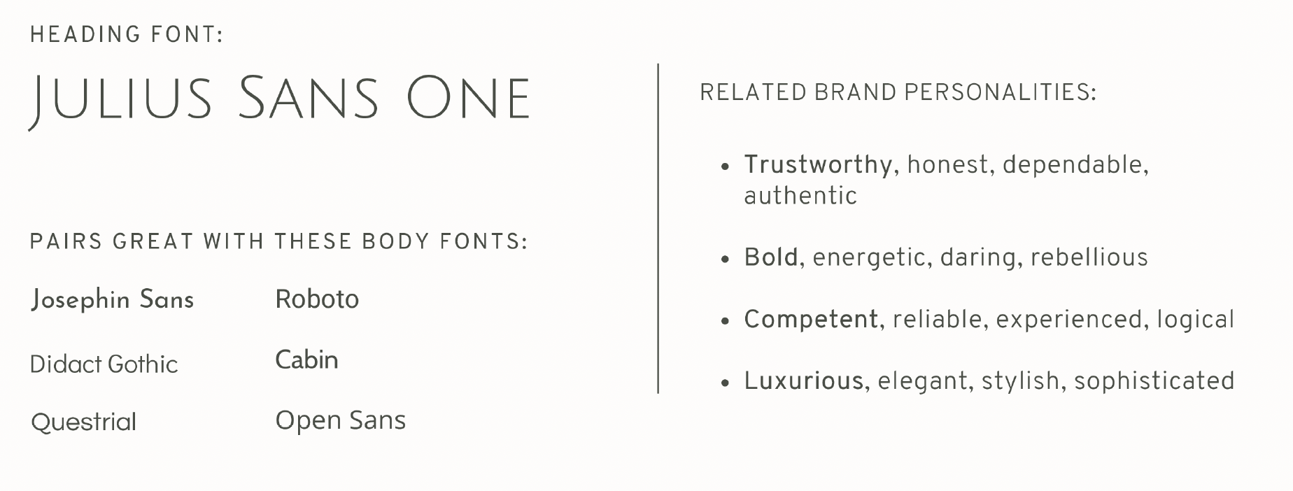
10) Juluius Sans One is Trustworthy, Bold, Competent, & Luxurious
Consider pairing with Josephin Sans, Roboto, Didact Gothic, Cabin, Questrial, or Open Sans.
Get the Complete Guide to Fonts
Including my favorite 48 font pairings, a full list of fonts available in both Squarespace and Canva, and more.


